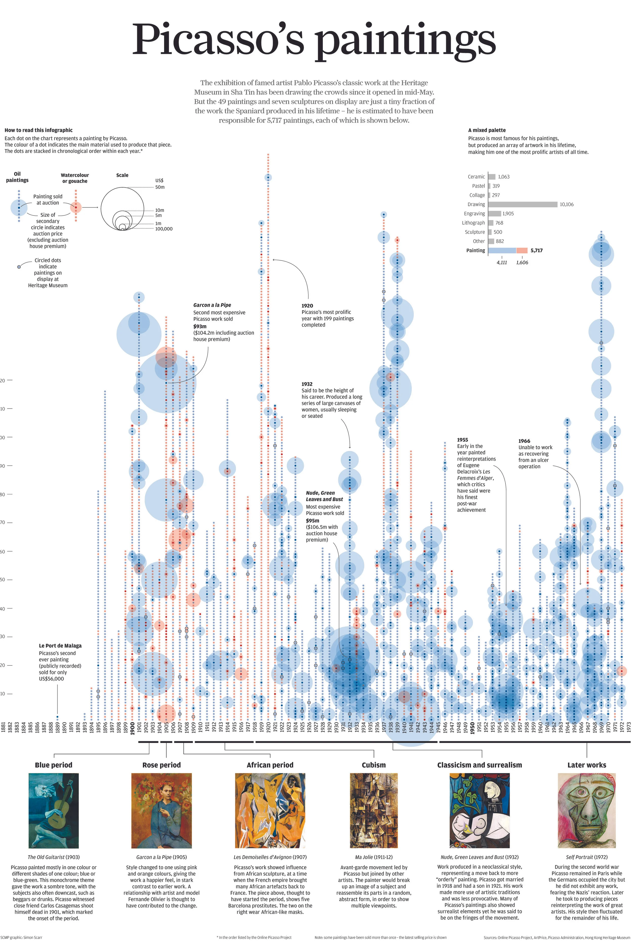
An exhibition of famed artist Pablo Picasso’s classic work came to the Heritage Museum in Sha Tin, Hong Kong, last year. But the paintings and sculptures on display were just a tiny fraction of the work the Spaniard produced in his lifetime. The public may be aware of some of his famous paintings but the aim was to show his prolific career in more detail.
The graphic looks at his work year by year, breaking it down by painting material and also indicating a selling price if the piece went to auction. The visualisation ran as a full printed broadsheet back page in Hong Kong's South China Morning Post newspaper.
By Simon Scarr
South China Morning Post
Awards
Malofiej - Gold
A closer look


A lot of time was spent on the key. This is one of the most important parts of the graphic to get right. If it isn't clear to the reader it can make a visualisation harder to understand. A few words accompanied this to explain more about the graphic.
Each dot represents a painting, stacked in chronological order by year.
Annotation was added to point out some of his biggest selling pieces, busiest years, highlights and notable achievements.
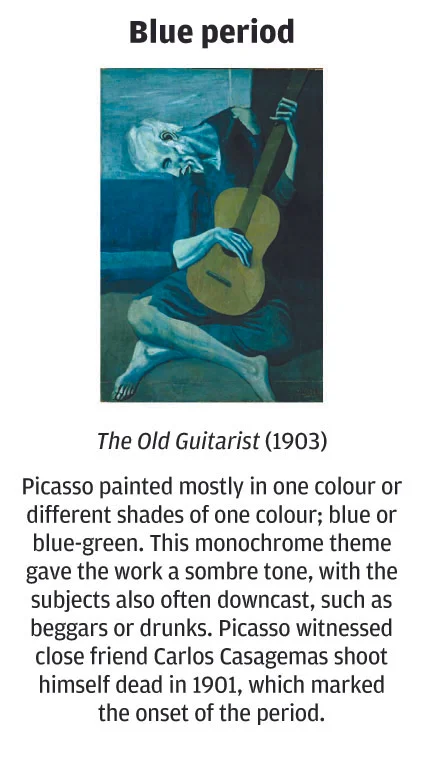
The timeline also indicated periods of his work. Picasso's style of painting and use of colour changed a lot over his career. It was important to explain this while showing some real examples. This also helps the reader connect the dots on the graphic to real pieces of artwork.